
The Latest History Dashboard is an Individual dashboard that allows you to display one or many data points over time with the option to include a team, group, or position average.
Builder Screen and Options:
1. Title of the dashboard
2. Field - Here, you can select a measurement field to display. Optionally, you can change how it is labeled on the dashboard and provide a unit.
3. Number of Values - Here you can select how far in the past the graph reaches, and how many data points to display
4. Include Averages - Selecting any of these options will display another line as a dotted line of team, group, or positional average.
5. Plot type - Choose from Line, Spline, Column, Bar, or Area
6. Show dates with values - If you leave this unchecked, all dates without values will still populate so you can see how much time between each data collection point. Checking this box removes the extra dates.
Understanding Latest History Dashboards
Latest History Dashboards display information as a series of data points in a format selected by the user. Your options to display this dashboard are as follows:
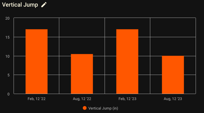
- Column - the plot on the Latest History Dashboard is in vertical column format
- Bar - the plot on the Latest History Dashboard is in horizontal bar format.
- Line/Spline - the plot on the Latest History Dashboard is in line/spline format. A line has harsh edges when connected and a spline has curved edges.
- Area - the plot on the Latest History Dashboard is in area format. An area format has a line plot and it is shaded in on the bottom
Example 1:
Line Graph
Example 2:
Column Graph
Example 3:
Spline Graph
Example 4:
Area Graph
Example 5:
Bar Graph
Comments
0 comments
Please sign in to leave a comment.