This article will show you:
- The different components you can include for your customized Latest History Dashboards and Radar Charts
- Examples of Latest History Dashboard and Radar charts with different xAxis and yAxis options.
Select your xAxis and yAxis
This step applies to only Latest History Dashboards and Radar charts, if you want a Boxplot or Dial, you can move onto the next step.
Latest History Dashboards:
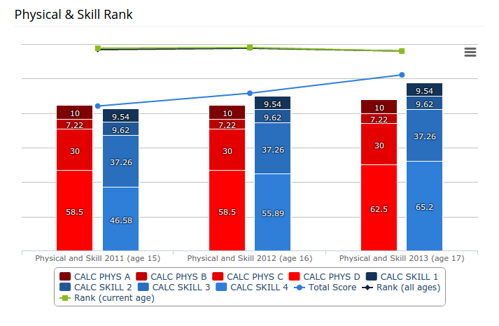
See Example 1.
First, select the xAxis you would like:
- DateTime
- Category
Then, select your yAxis:
- Column
- Bar
- Line/Spline
- Area
Radar Charts:
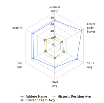
See Example 2.
First, select the xAxis you would like:
- Category
Then, select your yAxis:
- Column
- Line/Spline
- Area
Note: There is only one xAxis option available for Radar charts (Category). Refer to these two articles (Linear, Radar) to see examples of each type of axis.
You have the option to mix and match xAxis with either one yAxis or multiple yAxis. Below are two examples of a mix of linear and radar charts with either one yAxis or multiple yAxis.
Latest Mixed History Dashboard (Category xAxis with Column and Line yAxis)

Radar Chart (Category xAxis with Line yAxis)


Comments
0 comments
Please sign in to leave a comment.