Listed below are several types of charts you can have displayed on your athlete's dashboard:
This section will explain each type of chart available for you to select and the options available to customize the data you would like displayed.
Questionnaire Sum/Trend Dashboard
Latest History Dashboards display information as a series of data points called "markers" that are connected by straight line segments. For a Latest History Dashboard, you have the option to create several types of charts: Line, Spline, Column, Bar, and Area.
Line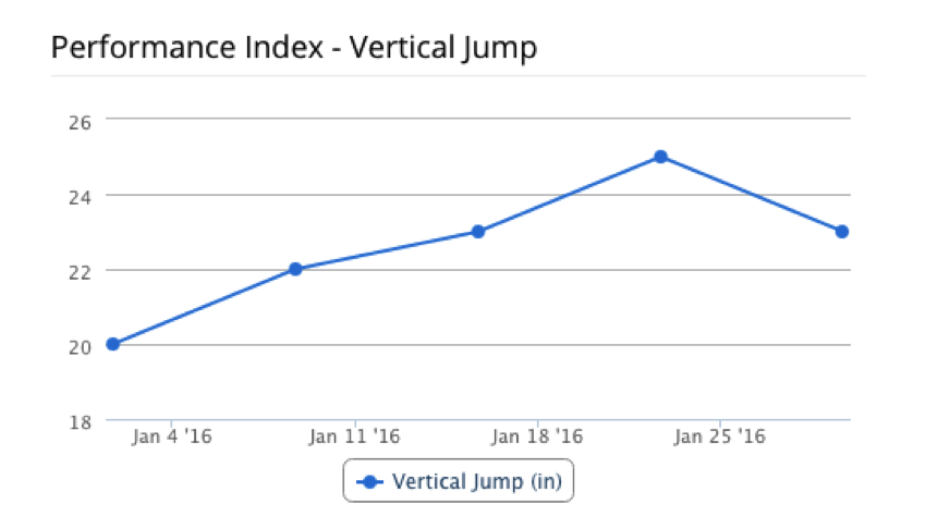 Bar
Bar
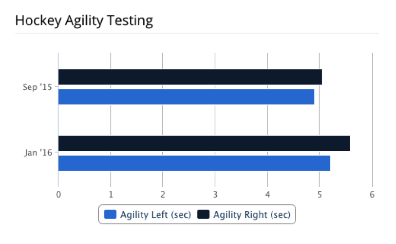
Column
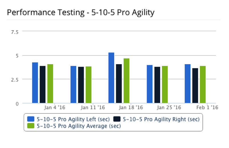
Area
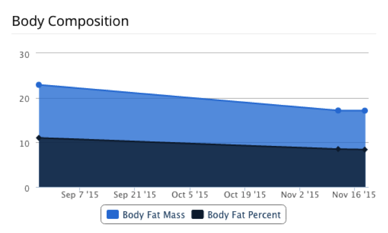
Spline
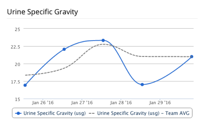
Basic Latest History Dashboard Options:
To learn about what components you need for your Latest History Dashboards, click here.
For more detailed information about Latest History Dashboards, click here.
Line vs. Columns
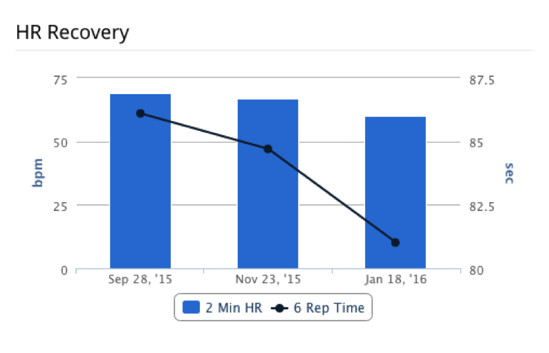
Lines vs. Stacked Columns
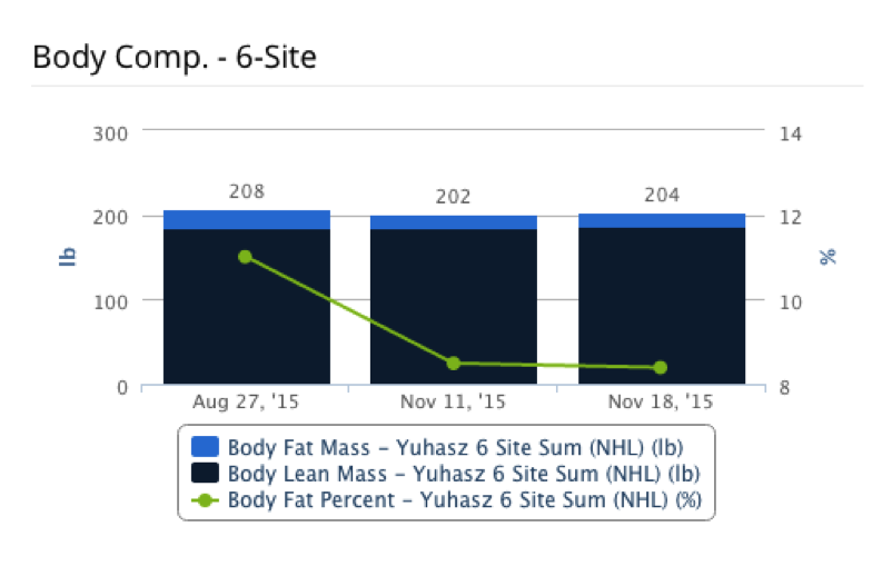
Line vs. Area Chart
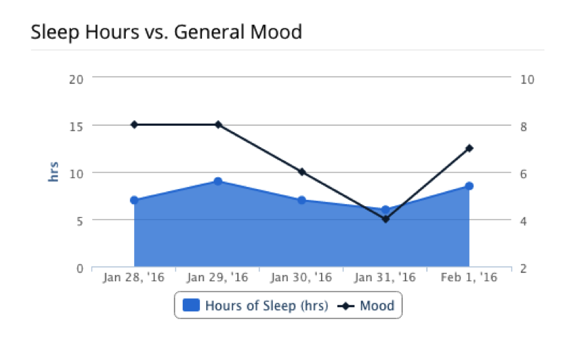
Spline vs. Stacked Columns
Optional:
Line or Spline
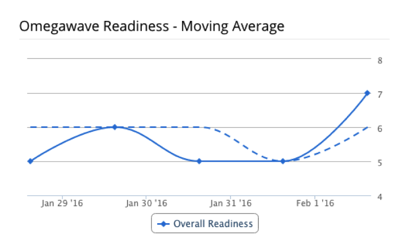
Line or Spline
Both with Thresholds
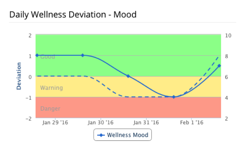
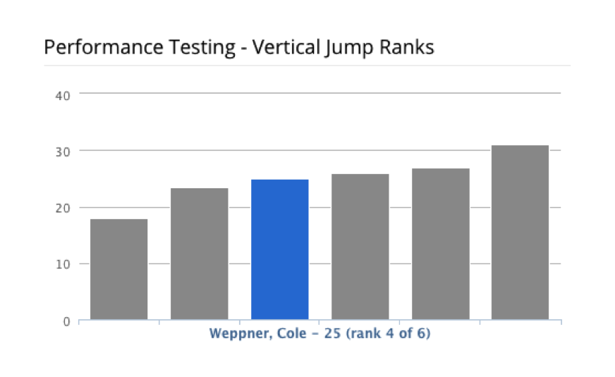
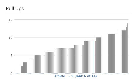
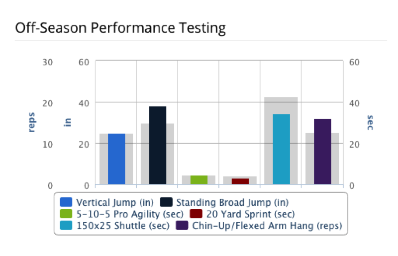
Averages to Display:
Latest vs Group Percentile Radar Dashboards are a graphical method of displaying multivariate data in the form of a two-dimensional chart of three or more quantitative variables represented on axes starting from the same point. For a linear chart, you have the option to create several types of charts: Line, Spline, Column, and Area.
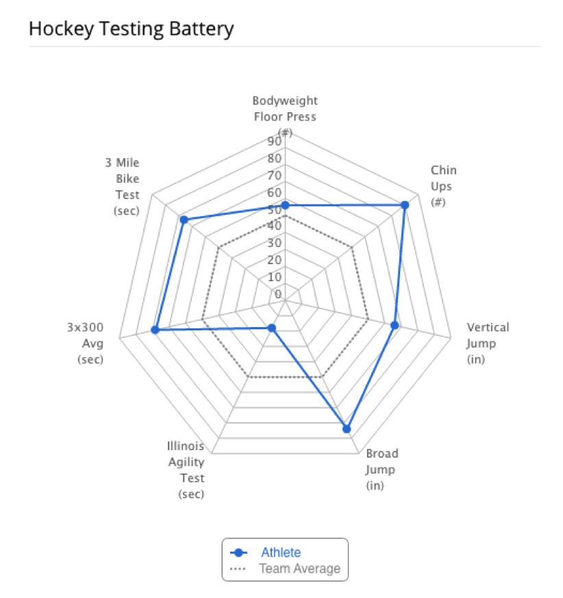
Radar Deviation with Related Groups
Percentile
Compare Against:
To learn about what components you need for your Radar Charts, click here.
For more detailed information about Radar Charts, click here.
A box plot is a standardized way of displaying the distribution of data based on the following information: minimum, first quartile, median, third quartile, and maximum.

To learn about what components you need for your Boxplots, click here.
For more detailed information about Boxplots, click here.
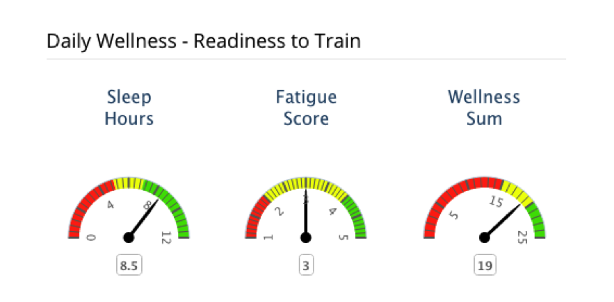
Dials allow you to easily review your athlete's performance. Notice how the dials are broken up into several colors. If the athlete's needle is in the "red" then they are performing poorly but if they are in the "green", they are performing well.
To learn about what components you need for your Dials, click here.
For more detailed information about Dials, click here.
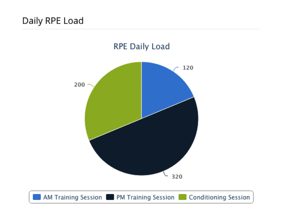
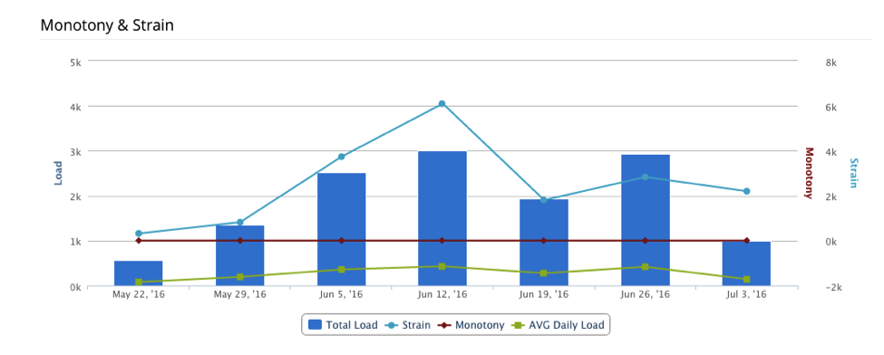
RPE Monotony & Strain History Dashboards are used to view the average daily load, training variation and overall training stress for each given week.

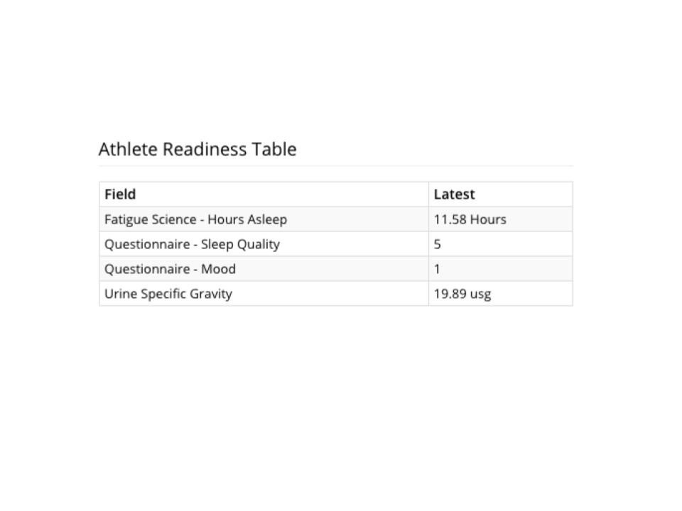
Latest Table Dashboard
What are Dashboards?
Detailed Information about Linear Charts
What Information You Need to Request a Linear Chart
Detailed Information about Radar Charts
What Information You Need to Request a Radar Chart
Detailed Information about Boxplots
What Information You Need to Request Boxplot
Detailed Information about Dials
What Information You Need to Request a Dial
- Questionnaire History Dashboard
- Questionnaire Sum/Trend History Dashboard
- Latest History Dashboard
- Latest Mixed History Dashboard
- Moving Average Dashboard
- Z-Score History Dashboard
- Latest Ranking vs Group Dashboard
- Latest vs Group/Self Average Dashboard
- Latest vs Group Percentile Radar Dashboard
- Latest vs Group Z-Score Radar Dashboard Example
- Boxplot
- Latest Dials Dashboard
- Latest Pies Dashboard
- RPE Monotony/Strain History Dashboard
- RPE Training Stress Balance History Dashboard
- Aggregate History Dashboard
- Latest Table Dashboard
- Library Photo Comparison Dashboard
- Tagged Recent Notes
- Training Exercise Set History Dashboard
This section will explain each type of chart available for you to select and the options available to customize the data you would like displayed.
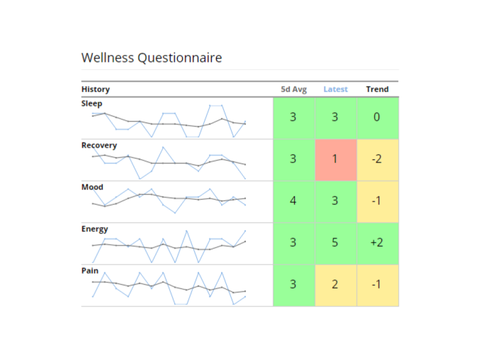
Questionnaire History Dashboard
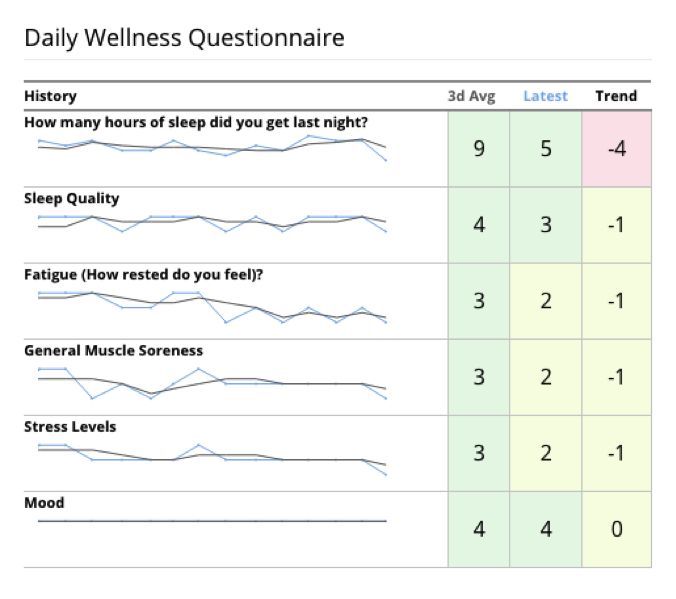
Questionnaire Sum/Trend Dashboard
Latest History Dashboard
Latest History Dashboards display information as a series of data points called "markers" that are connected by straight line segments. For a Latest History Dashboard, you have the option to create several types of charts: Line, Spline, Column, Bar, and Area.
Latest History Dashboards:
Line


Column

Area

Spline

Basic Latest History Dashboard Options:
- Position Average
- Team Average
To learn about what components you need for your Latest History Dashboards, click here.
For more detailed information about Latest History Dashboards, click here.
Latest Mixed History Dashboard
Line vs. Columns

Lines vs. Stacked Columns

Line vs. Area Chart

Spline vs. Stacked Columns
Optional:
- Position Average
- Group Average
- Team Average
Moving Average Dashboard
Line or Spline

Z-Score History Dashboard
Line or Spline
Both with Thresholds

Latest Ranking vs Group Dashboard


Compare against:
- Position Average
- Training Group Average
- Team Average
Latest vs Group/Self Average Dashboard

Averages to Display:
- Lifetime Average
- Position Average
- Training Group Average
- Team Training Group Average
- Optional: include Lifetime Min/Max
Latest vs Group Percentile Radar Dashboard
Latest vs Group Percentile Radar Dashboards are a graphical method of displaying multivariate data in the form of a two-dimensional chart of three or more quantitative variables represented on axes starting from the same point. For a linear chart, you have the option to create several types of charts: Line, Spline, Column, and Area.
Example of a Latest vs Group Percentile Radar Dashboard:

Radar Deviation with Related Groups
- z-score
Percentile
Compare Against:
- Position Values
- Training Group Values
- Team Group Values
To learn about what components you need for your Radar Charts, click here.
For more detailed information about Radar Charts, click here.
Latest vs Group Z-Score Radar Dashboard Example
Boxplot
A box plot is a standardized way of displaying the distribution of data based on the following information: minimum, first quartile, median, third quartile, and maximum.
Examples of Boxplot:

To learn about what components you need for your Boxplots, click here.
For more detailed information about Boxplots, click here.
Latest Dials Dashboard
Dials allow you to easily review your athlete's performance. Notice how the dials are broken up into several colors. If the athlete's needle is in the "red" then they are performing poorly but if they are in the "green", they are performing well.
Example of a Latest Dials Dashboard:

Dials with Thresholds
To learn about what components you need for your Dials, click here.
For more detailed information about Dials, click here.
Latest Pies Dashboard

- Up to four pie charts can be displayed.
- Aggregation Period with Day, Week, Month
- Aggregation Strategy with Sum, Average
RPE Monotony & Strain History Dashboard

RPE Monotony & Strain History Dashboards are used to view the average daily load, training variation and overall training stress for each given week.
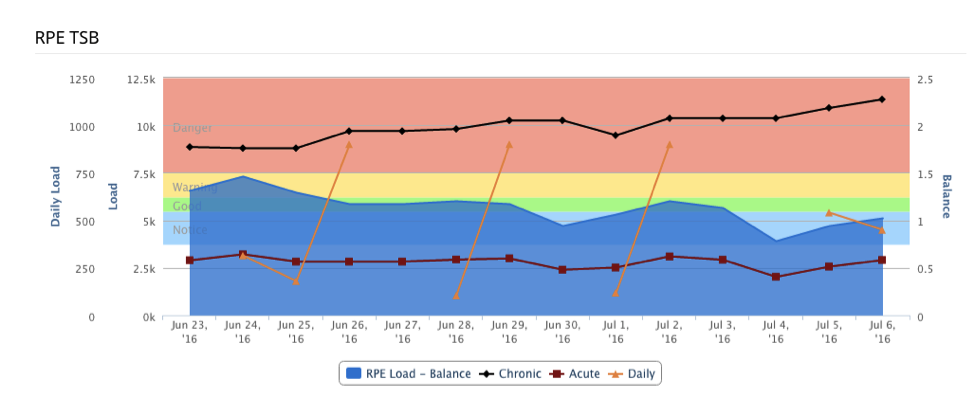
RPE Training Stress Balance History Dashboard

- Can be used to graph most, if not all, variables put into the CM+ system
- Choose number of days for both chronic and acute loads
- Red, yellow, green and blue threshold alerts
- TSB calculation = (acute sum * (chronic days / acute days)) / chronic sum
Aggregate History Dashboard
Latest Table Dashboard
Library Photo Comparison Dashboard

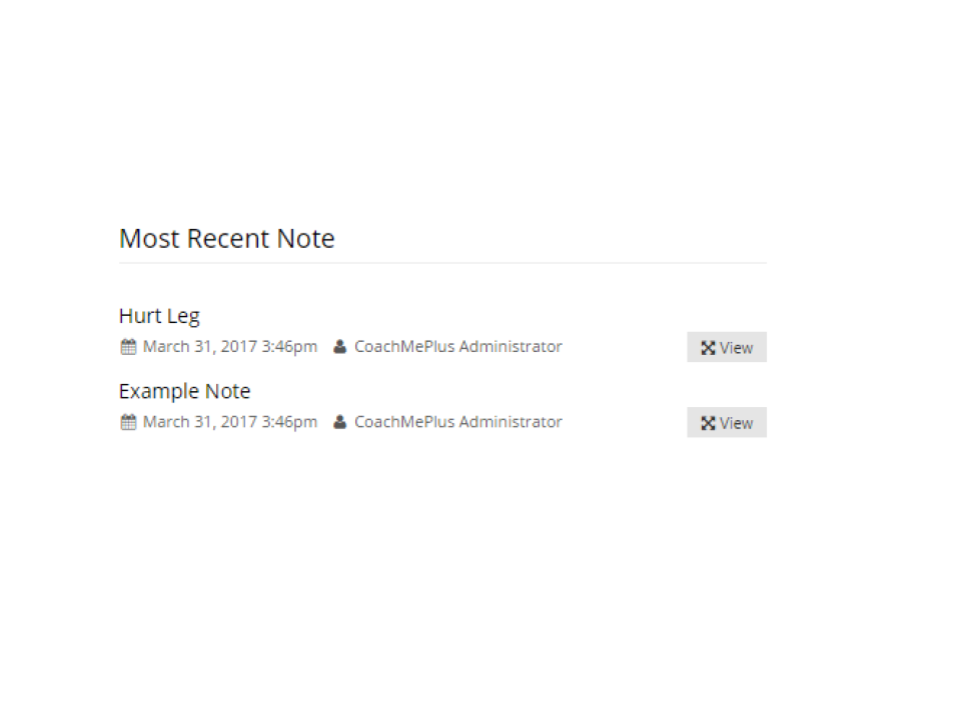
Tagged Recent Notes Dashboard
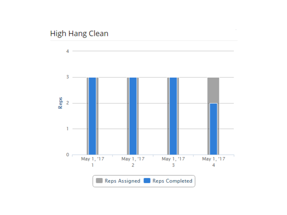
Training Exercise Set History Dashboard
Additional Information:
What are Dashboards?
Detailed Information about Linear Charts
What Information You Need to Request a Linear Chart
Detailed Information about Radar Charts
What Information You Need to Request a Radar Chart
Detailed Information about Boxplots
What Information You Need to Request Boxplot
Detailed Information about Dials
What Information You Need to Request a Dial

Comments
0 comments
Please sign in to leave a comment.