This article will show you:
- suggestions for selecting a threshold.
- various examples of different thresholds.
Select Threshold (Optional)
This step is optional. Thresholds have two options available for you to select from:
- Manual - You can manually pick the low, high, color, and name (Example 1).
- Quartile - You give us four colors and four names to use.
Example 1:
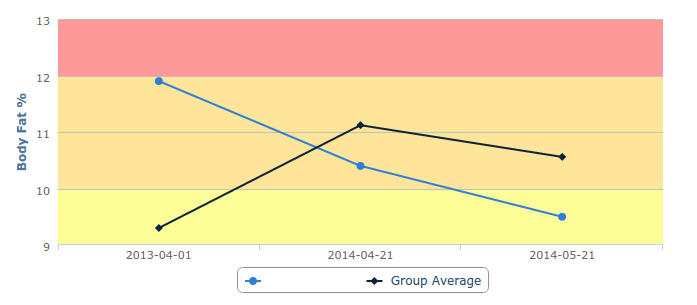
Manual Threshold
This chart's threshold was created manually. This means that a user picked the low, high, color, and name for the chart. If you want a chart to look a specific manner, this option is available.
Example 2:
Quartile Threshold
Dials are an example of quartile thresholds. This option is available if you have no preference to how your threshold look. This is automatically done based on a population. For example, if you pick a population, the colors to be based on the population, four highs/lows will be generated.
For this example, there are four colors: red, orange, yellow, and green. You can select any colors you want and if you want three colors instead of four, we can make two quartiles the same color.

Comments
0 comments
Please sign in to leave a comment.