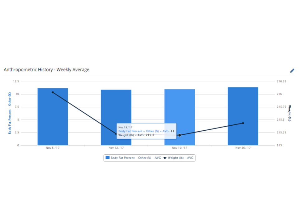
The Aggregate History Dashboard has always allowed you to take the sum, average, minimum, maximum, latest or oldest values and place them on a chart plot. However, you were only limited to only one plot type. With the latest update to the CoachMePlus Visualizations, you can now select multiple plot types in the Aggregate History Dashboard.
Learn how to build this visualization here.

Learn how to build this visualization here.

Comments
0 comments
Please sign in to leave a comment.